Sentosa Inclusive Wayfinding
Designs of inclusive wayfinding signages created to accommodate all visitors, with particular consideration for persons with disabilities, including wheelchair users and individuals with visual impairments, ensuring an accessible and seamless navigation experience for everyone.
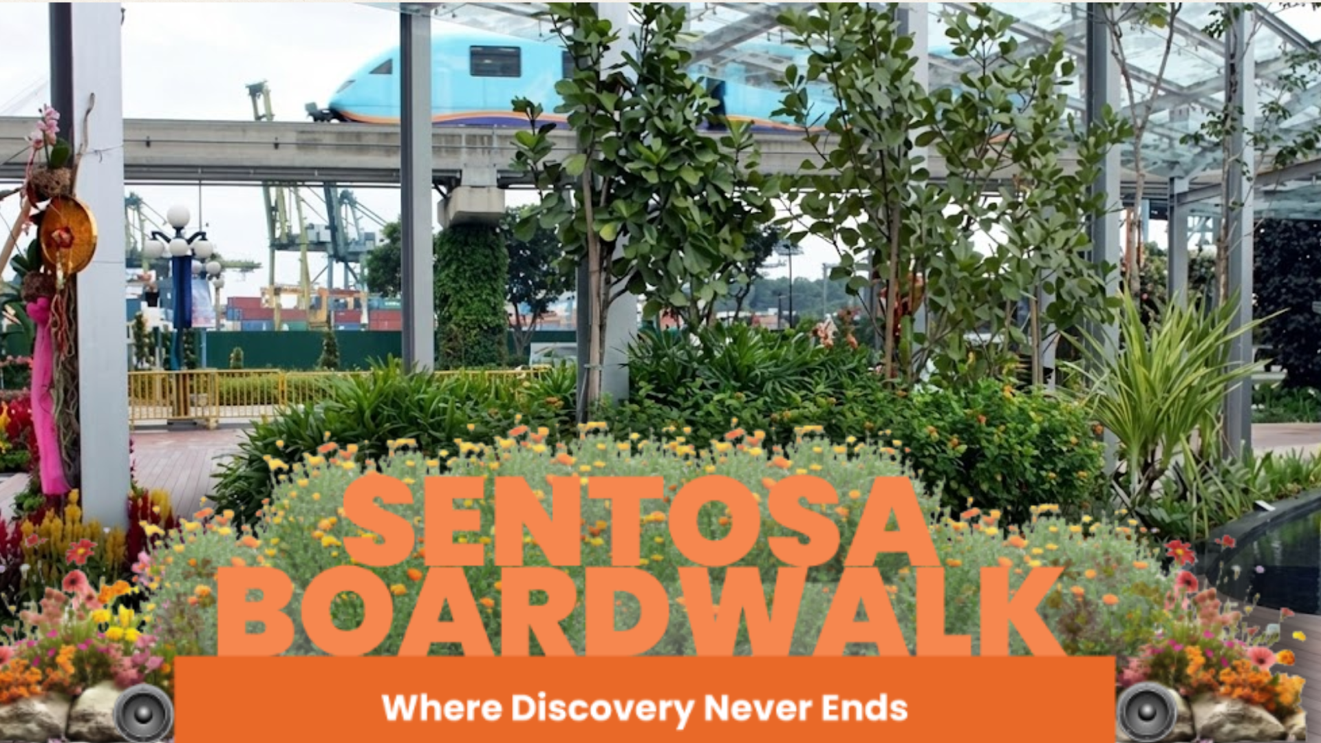
Sentosa Board Walk Destination Sign
The redesigned Sentosa Boardwalk signage features a warm orange theme with subtle beach decals that reinforce the destination’s identity. Poppins font is used for its clean, modern look, improving readability from various angles and distances. Measuring 340 cm wide and 150 cm tall, the signage is significantly more prominent than the previous version and is strategically placed for visitors approaching from Vivo City to easily identify the direction toward Sentosa.
To enhance inclusivity, it includes an audio message welcoming visitors and providing guidance for visually impaired users and also releases mist to elevate the experience. The signage serves as both a clear wayfinding tool and a welcoming entry point to the Boardwalk.
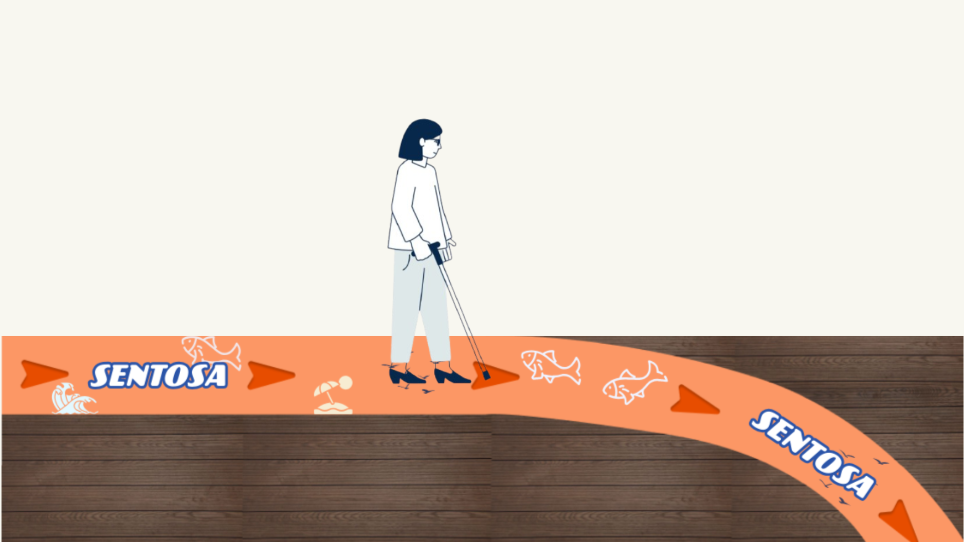
Floor-Based Wayfinding with Tactile Indicators
The floor-based signage system uses terracotta decals with darker tactile tiles to provide visual and tactile contrast for the visually impaired while reflecting Sentosa’s identity. “Sentosa” is displayed in the playful CCSpeedingBully font, styled in white with a blue outline for high readability. Directional arrow tactiles guide visitors along the path, and consistent naming reduces cognitive load for first-time or international visitors.
Spatial hierarchy separates primary navigation paths from secondary cues, ensuring key information is easily recognized. The system prioritizes accessibility with tactile tiles, embedded light indicators for low-light conditions, and high-contrast text, providing intuitive guidance for a wide range of users.
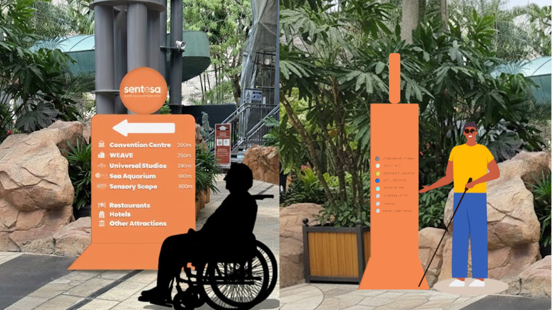
Directional Sign with Braille & Interactive Buttons
The inclusive wayfinding signage uses a warm orange background with white text for strong contrast, supported by color-coded tactile buttons that correspond to key landmarks. Destinations are clearly labeled with consistent names and distances, while Poppins typography and simple icons ensure readability for users of all ages, languages, and reading abilities. A clear top-to-bottom hierarchy features one main arrow for direction, larger text for key locations, and icons for quick recognition.
Accessibility is emphasized through placement at natural eye level for both standing visitors and wheelchair users. Braille and tactile color-coded buttons are positioned within easy reach and arranged in the same sequence as the listed destinations, enabling intuitive navigation and independent use for visually impaired visitors. This cohesive system creates a clean, user-friendly, and inclusive wayfinding experience.
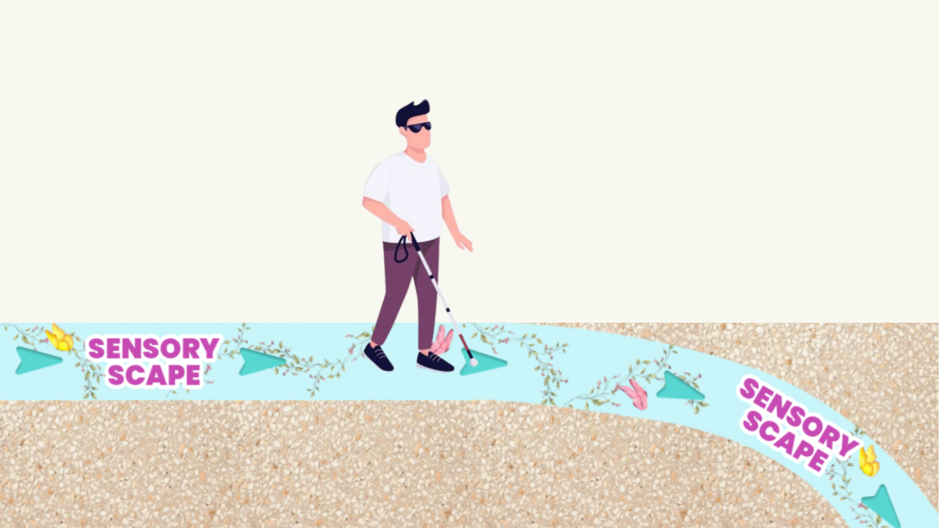
Floor-Based Wayfinding with Tactile Indicators
The floor-based wayfinding system for Sensoryscape uses clear naming, a strong spatial hierarchy, and accessible design to support easy navigation. The name “Sensoryscape” is simple and consistent, helping visitors connect with the space. Primary guidance comes from the tactile floor path and large text labels, while subtle butterfly and flower vine motifs reinforce the theme without distraction. Textured tactile tiles, strong color contrast, outlined typography, and light indicators along the tactile arrows ensure the system remains legible for users with low vision or cognitive impairments in both day and night conditions.
The floor decal features a soft pastel aqua to create a calming, nature-inspired atmosphere, paired with a darker shade for the tactile path to ensure contrast. “Sensoryscape” is displayed in the clean, legible Poppins font with a white outline, and directional icons are subtly integrated to support wayfinding while maintaining the gentle visual tone.
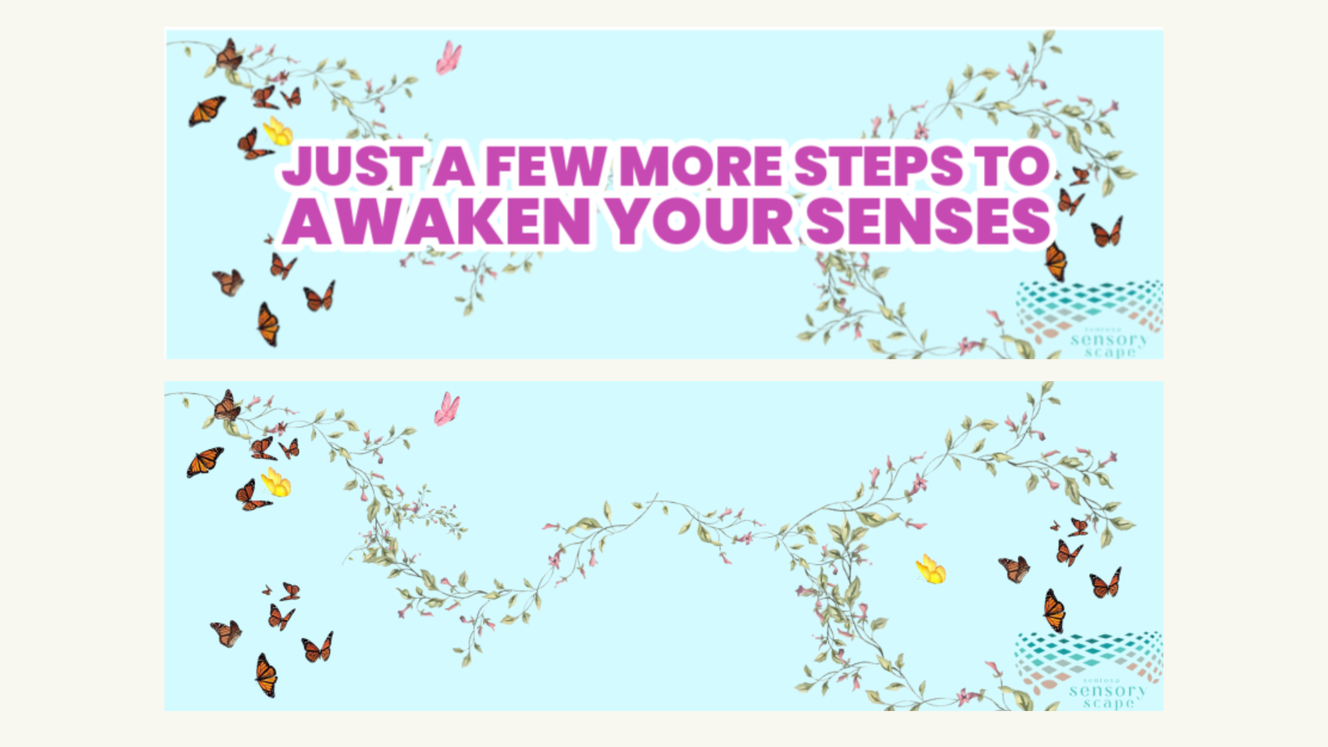
Sensory Scape Ambient Graphic
The ambient graphic leading toward Sensoryscape is designed to blend with its surroundings while supporting wayfinding. It uses the same color palette as the tactile floor elements, creating visual consistency along the walkway and reinforcing the direction of movement. Positioned near the Sensoryscape area, the graphic provides reassurance that visitors are approaching their destination. Calming ambient music plays from a nearby pillar, offering an additional sensory cue for visitors with visual impairments without overwhelming the environment.
The Sensoryscape logo is included for clear identification, and the text is set in the clean, modern Poppins font. The purple lettering contrasts effectively against the turquoise background, enhancing readability while maintaining a calming aesthetic. Together, the graphic and audio cues create a multisensory, inclusive experience that strengthens the identity of Sensoryscape and supports intuitive navigation for all visitors.
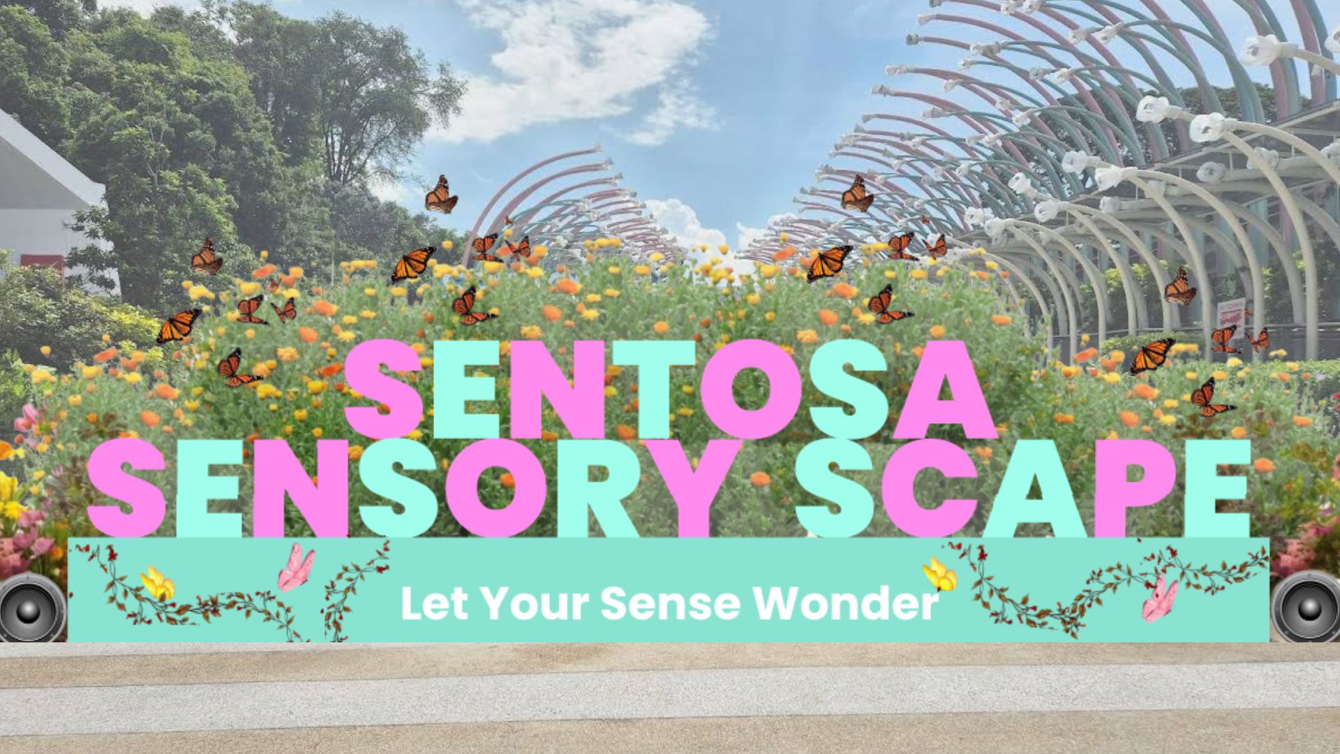
Sensory Scape Destination Sign
The redesigned Sensoryscape destination signage, labeled ‘Sentosa Sensoryscape,’ features alternating cyan and purple letters in Poppins font for vibrancy, clarity, and readability. Enlarged to 340 cm by 150 cm, it now stands out as a photo-worthy landmark compared to the previous understated design.
To create an immersive and inclusive experience, the signage integrates multisensory elements: a welcome audio message with ambient sounds, soft mist with a subtle scent, and kinetic butterflies that enhance the whimsical theme. The sound and scent also act as gentle guides for visually impaired visitors, signaling that they have arrived at their destination. Together, these features make the signage functional, memorable, and inclusive for all.